Appearance
Branding
Branding in ACE Widgets lets you adjust the look and feel of your widgets to match your company’s design system or styling guidelines. It uses a schema that defines design tokens, allowing for customization of colors, spacing, and typography. This approach helps maintain visual consistency across your widgets.
Components within widgets can't be styled with regular CSS by default. This restriction helps ensure that the interfaces remain consistent and high-quality, no matter where they’re embedded. However, we make an exception for certain attributes, like fonts, to allow basic styling on the containing website to be cascaded down.
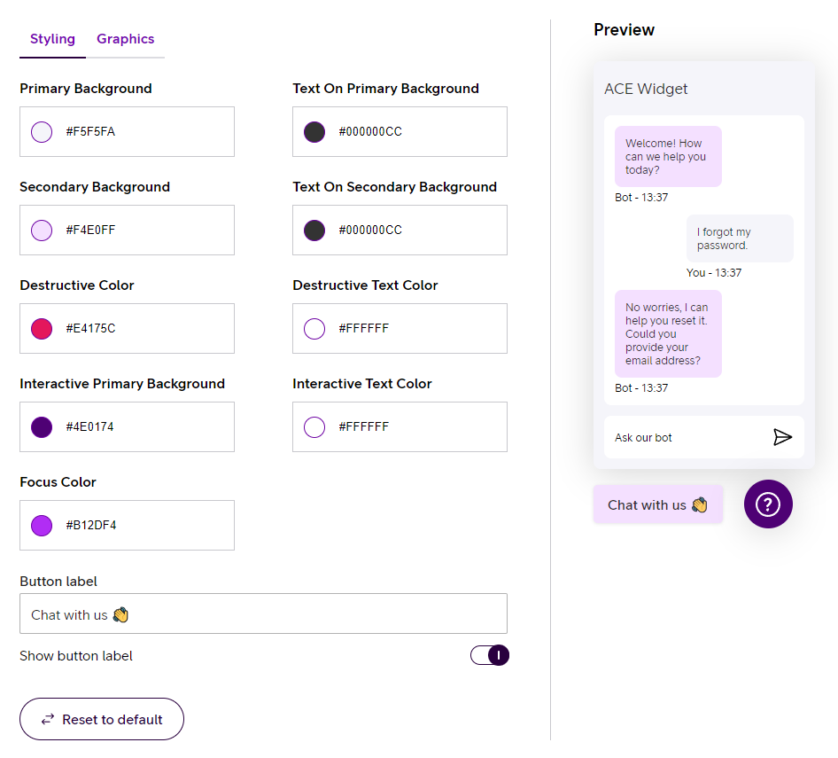
Widget Studio
Customizing branding can be easily done in Widget Studio, a visual editor available directly on the ACE Portal.
JSON configuration
WARNING
The below configuration method is available only for users with developer access to ACE Widgets. If you do not have developer access, please refer to Widget Studio for customization options.
In the current version of the branding protocol, we offer a limited set of design tokens. These tokens are part of our ongoing effort to support the evolving needs of widget customization.
Colors
primaryBackground
Defines the primary background color. This color serves as the main backdrop for most UI elements and sets the overall tone and aesthetic of the widget.
textOnPrimaryBackground
Defines the text color to be used on the primary background. This color should ensure that the text remains legible and accessible when placed over the primary background.
secondaryBackground
Defines the secondary background color. Typically used for secondary or less prominent UI elements, this color should complement the primary background and provide a visual hierarchy.
textOnSecondaryBackground
Defines the text color to be used on the secondary background. This color should be carefully selected to maintain readability and contrast on the secondary background.
interactivePrimaryBackground
Defines the background color for primary interactive elements like buttons, sliders, or toggles. This color is crucial for signaling actionable areas within the widget, ensuring users can easily recognize where they can interact. This color is also used on text links and needs to be highlighted.
interactiveTextOnPrimaryBackground
Defines the text color used on primary interactive elements. This color should be chosen to provide optimal contrast against the interactivePrimaryBackground, ensuring that the text remains clear and readable in all scenarios.
interactiveDestructiveBackground
Defines the color used to indicate destructive actions within the widget, such as delete buttons or warnings. This color should usually be vibrant and attention-grabbing, signaling to users that the associated action could have serious consequences or is irreversible.
interactiveTextOnDestructiveBackground
Defines the text color used in contexts where destructive actions are indicated, such as on buttons or links that perform deletions or other irreversible actions. The color should typically contrast strongly with the destructive color to ensure that these actions are clearly communicated to the user.
focusColor
Defines the color used to indicate focus states for interactive elements, such as buttons, form fields, or links. This color should be highly visible, helping users to easily identify the element that is currently active or selected.
Example Configuration
Below is a JSON snippet demonstrating how to apply branding configurations:
json
{
  "config": {
    "branding": {
      "colors": {
        "primaryBackground": "#F5F5FA",
        "textOnPrimaryBackground": "#000000CC",
        "secondaryBackground": "#F4E0FF",
        "textOnSecondaryBackground": "#000000CC",
        "interactiveDestructiveBackground": "#E4175C",
        "interactiveTextOnDestructiveBackground": "#FFFFFF",
        "interactivePrimaryBackground": "#4E0174",
        "interactiveTextOnPrimaryBackground": "#FFFFFF",
        "focusColor": "#B12DF4"
      }
    }
  }
}
Graphical Assets
In addition to colors, you can incorporate custom graphical assets, like logos, into your widget's branding. These assets are specified in the graphics section of the branding object. Below are the properties that can be customized:
logotype
URL to an image to be used as the logotype for the widget.
trigger
URL to an image for the trigger button that opens the widget.
Example Configuration
Here is how you can include graphical assets in your branding configuration:
json
{
  "config": {
    "branding": {
      "graphics": {
        "logotype": "http://url-to-my-image.png",
        "trigger": "http://url-to-my-image.png"
      }
    }
  }
}